
How to Use Google Trends to Validate Demand Before You Build (Complete Guide)
August 13, 2026 · 8 min read
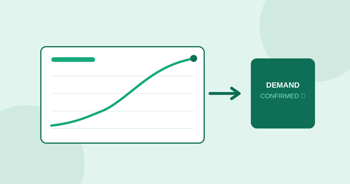
Google Trends is free, fast, and one of the most misread tools in a founder's research stack. Most people open it, type in a keyword, glance at a line going up or down, and draw a conclusion in about four seconds. That is not analysis, and it is exactly why so many founders end up either chasing a trend that was already peaking on the way down, or abandoning a genuinely good niche because the graph looked flat when the flatness meant something else entirely.
This guide covers how to read Google Trends correctly for market validation: what the different chart shapes actually mean, which comparisons matter more than absolute numbers, and why Trends data by itself, no matter how carefully you read it, can only ever answer half the question you actually need answered before you build.
What Google Trends actually measures
Google Trends does not show search volume. It shows relative search interest, indexed to 100 at the peak of whatever time window and region you selected. That distinction matters more than it sounds. A term scored 100 in January and 40 in June was not searched 100 times and then 40 times, it was searched at its highest relative frequency in January and at 40 percent of that peak in June, within your chosen window. Change the date range and the same term's shape can look completely different, because the peak the scale is anchored to has moved. Read Trends as a shape, a direction, a relative comparison, never as a raw number.
The four chart shapes and what each one actually means
A steady climb over 12 to 24 months, without a single seasonal spike explaining it, usually means genuine, structural growth in interest, the kind worth building around. A spiky, sawtooth pattern that repeats on a yearly cycle means seasonality, not growth, and you need to know whether your business model can survive the troughs between spikes, not just the peak. A flat line at a moderate, stable level often means a mature, steady niche, not a dead one; steady demand with weak competition can be a better bet than an exciting spike that will not still be growing next year. And a sharp spike followed by an immediate, steep drop usually means a fad or a news event, the riskiest shape to build a business around, because by the time you notice the spike it may already be cresting.
The comparisons that matter more than the raw chart
The single most useful Google Trends feature for validation is not the main chart, it is the compare function. Put your niche term next to two or three adjacent or competing terms and watch the relative lines, not just your own. A term climbing in isolation might still be losing share to a competing term climbing faster; a term that looks flat on its own might actually be gaining share against a category leader that is declining. Related queries and rising queries, both available beneath the main chart, are often more useful than the chart itself: they show you the specific phrases people are searching for right now, including breakout terms Google flags as recent and rapidly growing, which frequently surface a sub-niche or a specific complaint before it shows up anywhere else in your research.
Regional and category filters change the story
A term that looks flat nationally can be climbing sharply in three specific states or countries, and a niche that looks saturated in aggregate can be wide open once you filter by region. Always check the regional breakdown before concluding a niche is dead, especially if you are willing to launch narrower than the whole national or global market. Category filtering matters just as much: a generic keyword often blends unrelated search intents together (a tool name that is also a common English word, for instance), and switching to the relevant category, when Trends offers one, removes noise that would otherwise flatten or distort a real trend.
Why Google Trends alone cannot validate an idea
Here is the limitation that Trends can never fix, no matter how carefully you read the chart: it tells you how many people are searching, not why, and not how much the underlying problem hurts. A rising search line could mean a growing, painful problem people are increasingly desperate to solve, or it could mean rising curiosity about a topic nobody actually intends to pay to fix. Trends has no concept of intensity, frustration, or willingness to pay, because it only counts searches, not the sentiment behind them. Two niches can post identical, healthy upward lines, one full of people searching out of mild curiosity and one full of people searching because they are losing money weekly, and Trends alone cannot tell you which is which.
Pairing Trends with complaint data
The fix is to treat Google Trends as a volume and direction check, run alongside, never instead of, complaint mining. Trends tells you how many people care and whether that number is growing or shrinking; Reddit threads, Amazon reviews, YouTube comments and Quora questions tell you how much the problem hurts and what people have already tried. A niche that shows both a rising Trends line and specific, intense, money-or-time-language complaints across multiple sources is a much stronger signal than either data point alone. A rising Trends line with only mild, generic complaints suggests curiosity without pain, a shrinking pool of eventual buyers. A flat Trends line with intense, specific complaints can still be a strong niche, just a smaller and more stable one than a founder chasing growth charts might expect.
A practical five-minute check before you dig deeper
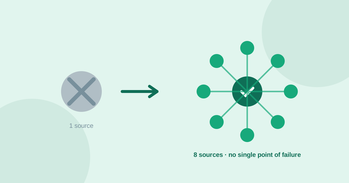
Search your niche term, set the window to 12 or 24 months, and note the shape. Add two competing or adjacent terms and check whether you are gaining or losing relative share. Check the regional breakdown for pockets of concentrated interest. Scroll to related and rising queries and note anything you had not considered. Then, whatever the chart shows, go read actual complaints on at least two other platforms before drawing a conclusion. UserConcern runs this pairing automatically: Google Trends alongside Reddit, Amazon reviews, YouTube, TikTok, X, Quora and AI answers, in one search, so a rising interest line and a genuine, intense pain point either confirm each other or reveal that one of them was misleading you alone.
Frequently asked questions
Does Google Trends show actual search volume?
No. It shows relative search interest indexed to 100 at the peak of your selected date range and region, not raw search counts. The same term can look different depending on the time window you choose, because the scale is anchored to whatever peak falls inside it. Read it as a shape and a direction, not as an absolute number.
Is a flat line on Google Trends a bad sign?
Not necessarily. A flat, stable line at a moderate level often means a mature, steady niche rather than a dying one. Steady demand paired with weak competition can be a better opportunity than an exciting spike that will not still be growing a year from now. Check regional filters too, since a flat national line can hide sharp regional growth.
Can I validate an idea with Google Trends alone?
No. Trends measures how many people are searching and whether that is rising or falling, but it has no way to measure why they are searching or how much the underlying problem hurts. A rising line can mean growing pain or just growing curiosity, and Trends alone cannot tell you which. Pair it with complaint mining on platforms like Reddit, Amazon reviews and YouTube to confirm intensity, not just interest.
What is the most useful Google Trends feature for market research?
The compare function, used to put your niche term next to two or three adjacent or competing terms so you can see relative share, not just an isolated line. Related and rising queries, listed below the main chart, are also highly useful, since they often surface a specific sub-niche or emerging complaint before it appears anywhere else in your research.
More articles
 Market Research
Best GummySearch Alternatives in 2026 (Access Ends 30 November)
GummySearch closed to new customers in November 2025, and existing users lose access on 30 November 2026 with all data deleted the next day. Eight alternatives compared on real pricing, real sources, and which half of the job each one actually replaces.
Read article → Market Research
How to Identify Customer Pain Points: 7 Methods That Actually Work
Customer pain points are the raw material of every successful product. Here are 7 practical methods to find them, from free manual research to AI-powered analysis.
Read article →